Light and Airy Spring Color Palette Ideas for Your Home
This post may contain affiliate links, which means we may earn a small commission at no extra cost to you. We may also display third-party ads and include links to partner brands or shops. Some images may be created or enhanced using AI or sourced from licensed platforms. All opinions are our own.
Spring is the season of soft light, open windows, and gentle color.
After months of deeper winter tones, your home may be ready for something brighter. A light and airy palette can make every room feel calmer, fresher, and more spacious without a full redesign.
The secret is not using more color, but choosing the right ones. Think muted, sun-washed shades layered with warm neutrals and natural textures.
Here are 12 light and airy spring color palette ideas to refresh your home beautifully.
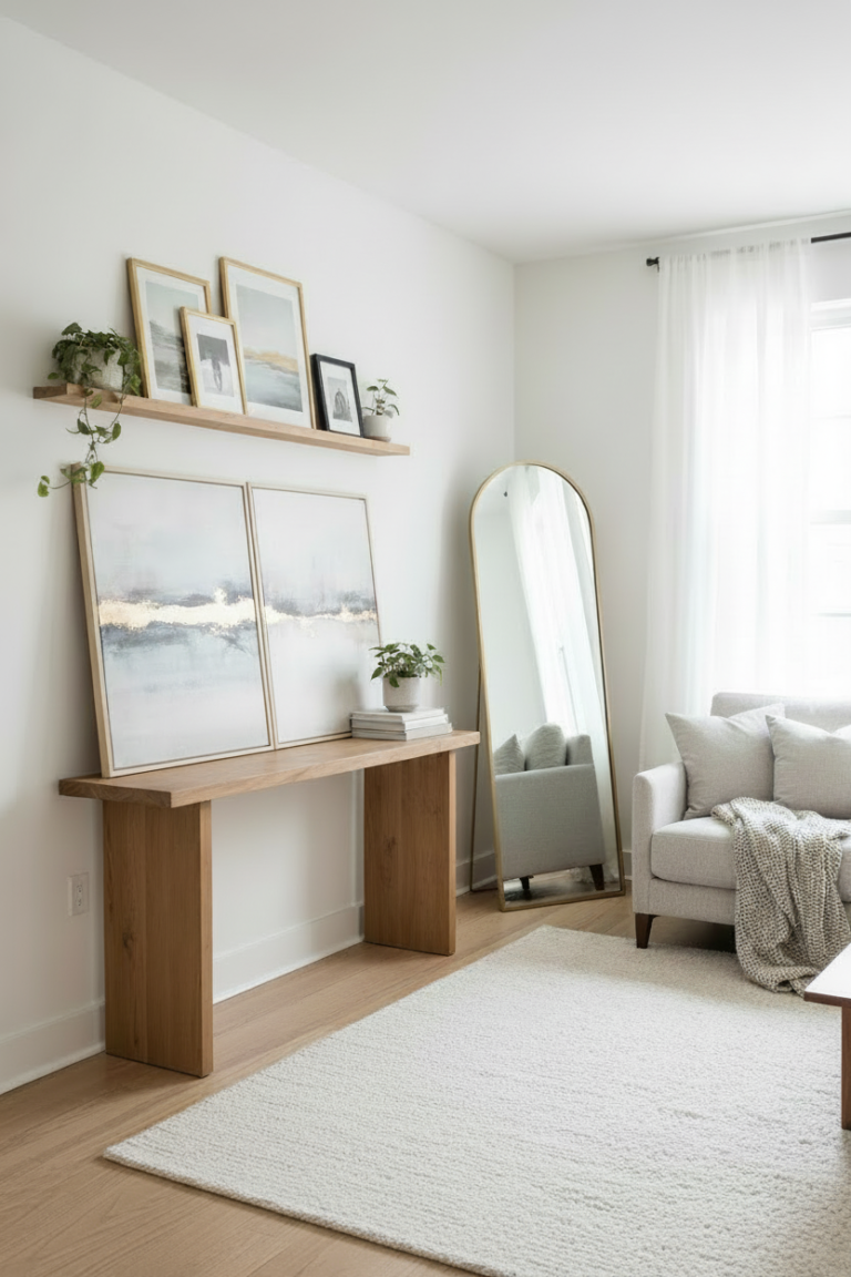
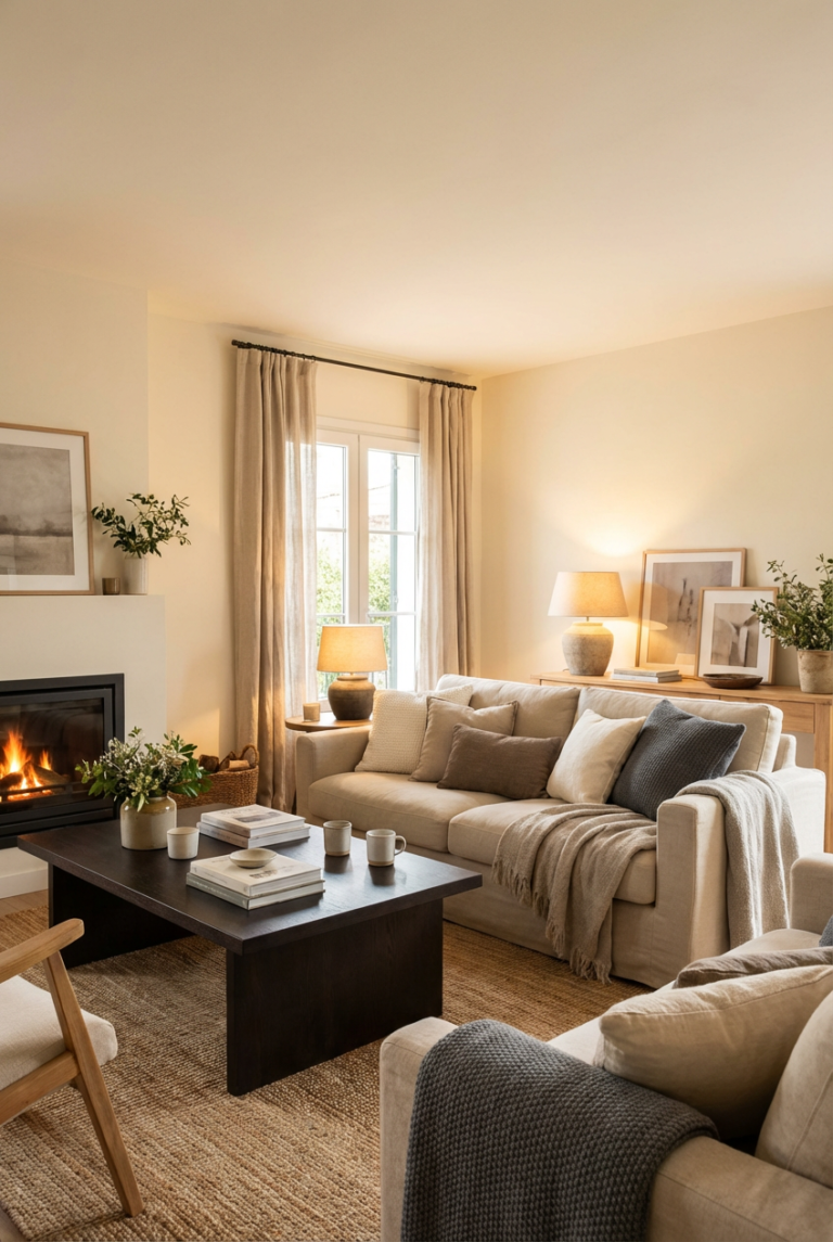
1. Soft White and Warm Beige
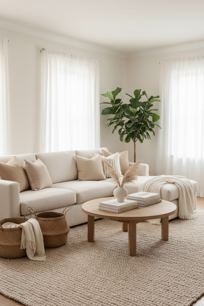
Start with a creamy white as your base.
Pair it with warm beige in textiles like throw pillows, curtains, and rugs. This combination feels clean but not stark.
Layer in light wood furniture and woven baskets to add warmth. The mood is calm, cozy, and softly sunlit.
2. Pale Sage and Ivory
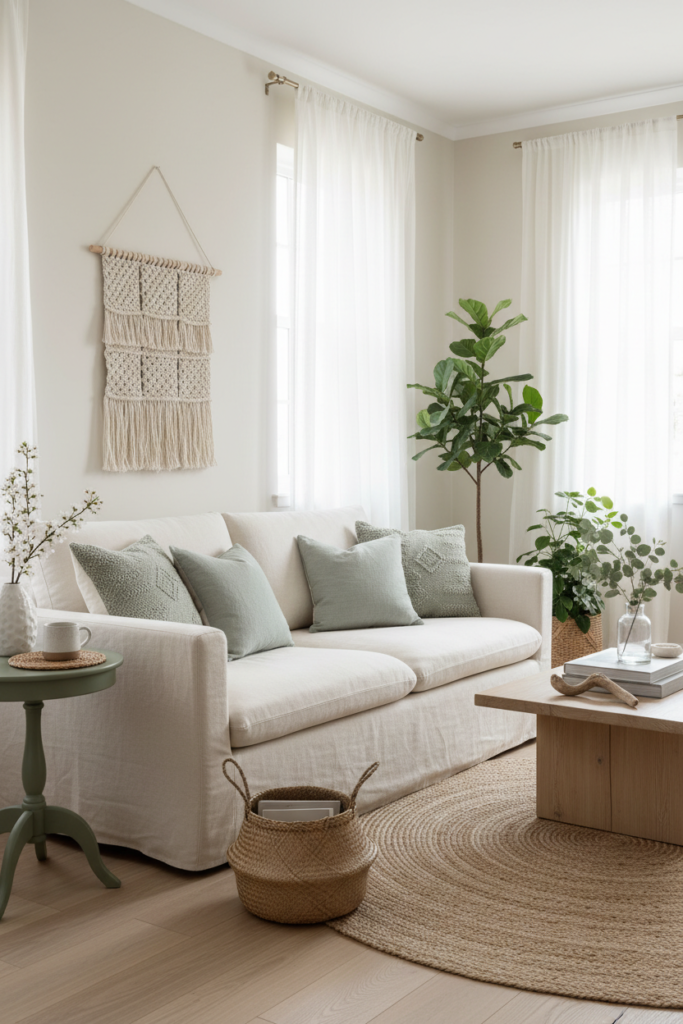
Sage green instantly brings a touch of nature indoors.
Use pale sage on accent pillows, artwork, or a painted side table. Balance it with ivory walls or upholstery to keep the look light.
Add natural textures like linen and rattan to enhance the organic feel.
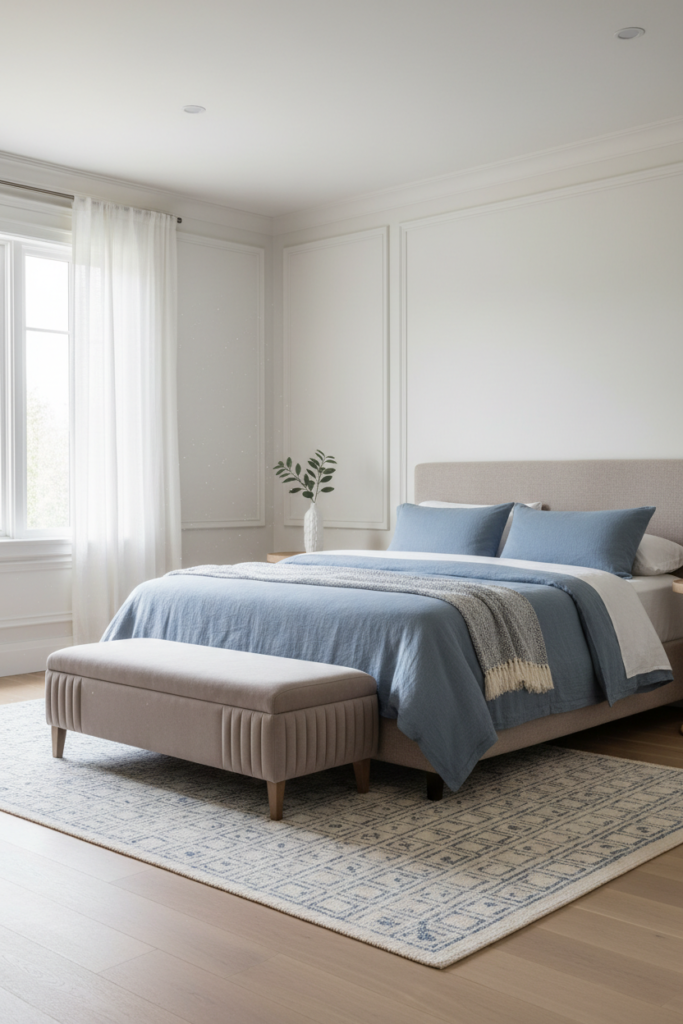
3. Dusty Blue and Crisp White
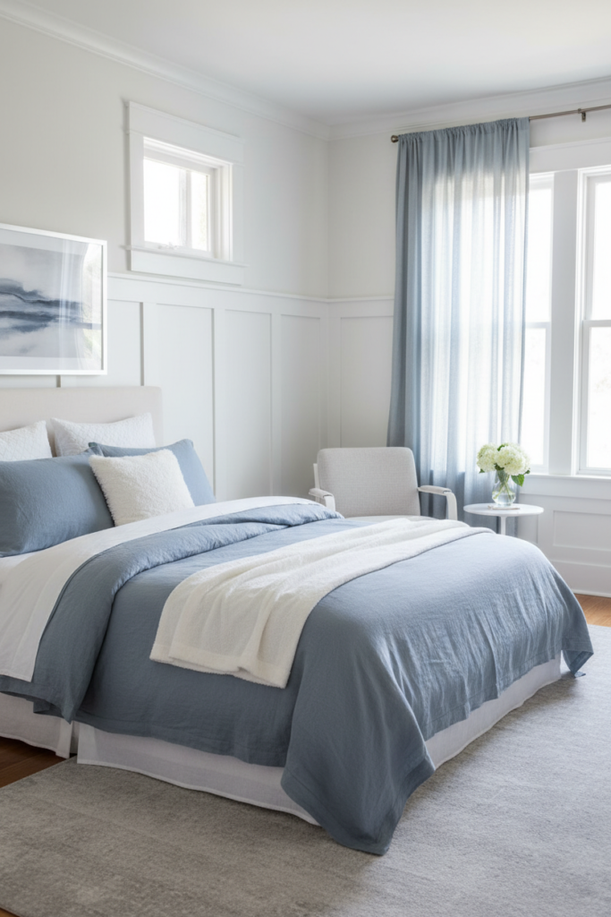
Dusty blue has a relaxed, airy quality.
Use it in bedding, curtains, or a soft area rug. Pair it with crisp white trim and light gray accents for a clean contrast.
The overall effect feels breezy, like a clear spring sky.
4. Blush Pink and Light Oak
Blush can be subtle and sophisticated.
Choose a muted blush for throw blankets or accent chairs. Combine it with light oak furniture and cream walls.
Add brass or glass details for a soft glow in the evening light.
5. Muted Lavender and Soft Gray
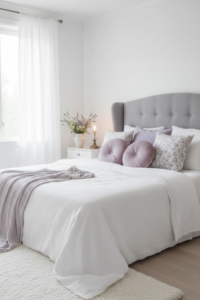
Lavender works best when it is barely there.
Use it in small doses through artwork or pillows. Pair it with soft gray upholstery and white walls.
The combination feels fresh, peaceful, and slightly romantic without being overly sweet.
6. Buttercream and Pale Yellow
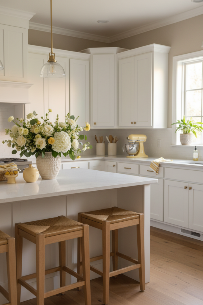
Soft yellow can feel warm and uplifting.
Choose a buttercream shade rather than a bright lemon. Use it in kitchen accessories, floral arrangements, or a painted stool.
Keep the rest of the room neutral with white and light wood to maintain balance.
7. Light Terracotta and Cream
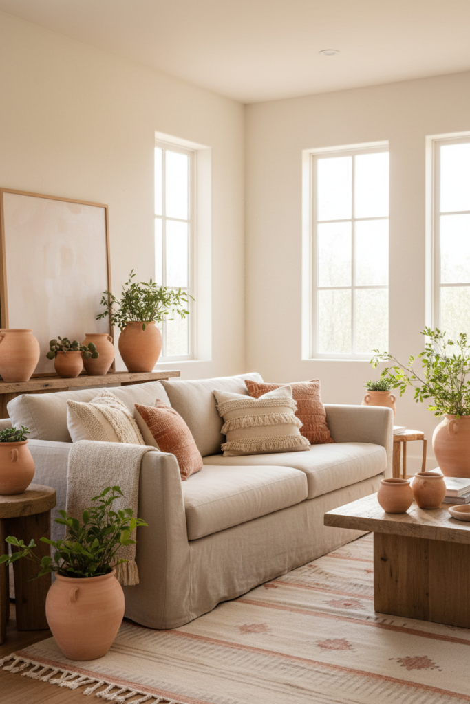
For a warmer spring palette, try light terracotta.
Use it in clay pots, textured pillows, or subtle patterned rugs. Pair it with cream walls and soft beige fabrics.
This combination feels grounded yet fresh, especially in rooms with plenty of sunlight.
8. Seafoam Green and Sand
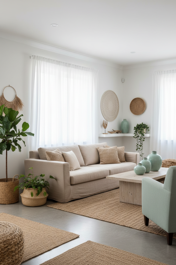
Seafoam green feels coastal and light.
Incorporate it through accent chairs, vases, or artwork. Pair it with sandy beige tones and white walls.
Add linen curtains and woven textures to enhance the breezy atmosphere.
9. Powder Blue and Soft Taupe
Powder blue has a delicate, airy look.
Use it on bedding or as an accent wall in a small room. Combine it with soft taupe furniture and warm white trim.
The mix feels balanced and sophisticated while still feeling bright.
10. Soft Coral and Warm White
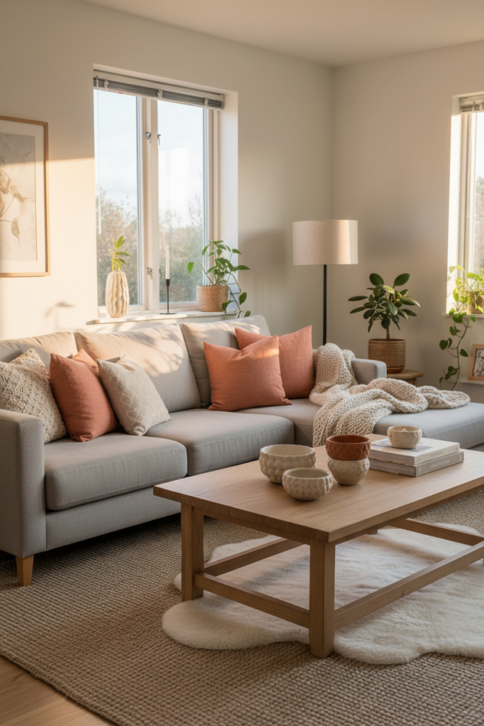
A muted coral adds energy without overwhelming the space.
Introduce it in small accents like throw pillows or decorative bowls. Balance it with warm white walls and natural wood finishes.
The mood feels cheerful but still calm and welcoming.
11. Pale Mint and Light Gray
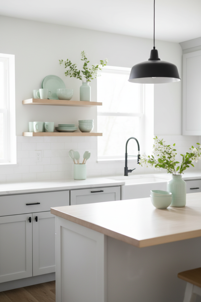
Pale mint offers a subtle pop of freshness.
Use it in kitchen accessories, bathroom towels, or decorative ceramics. Pair it with light gray cabinetry or furniture.
Keep metal finishes simple, like brushed nickel or matte black, for a modern touch.
12. Cream, Sage, and Natural Wood
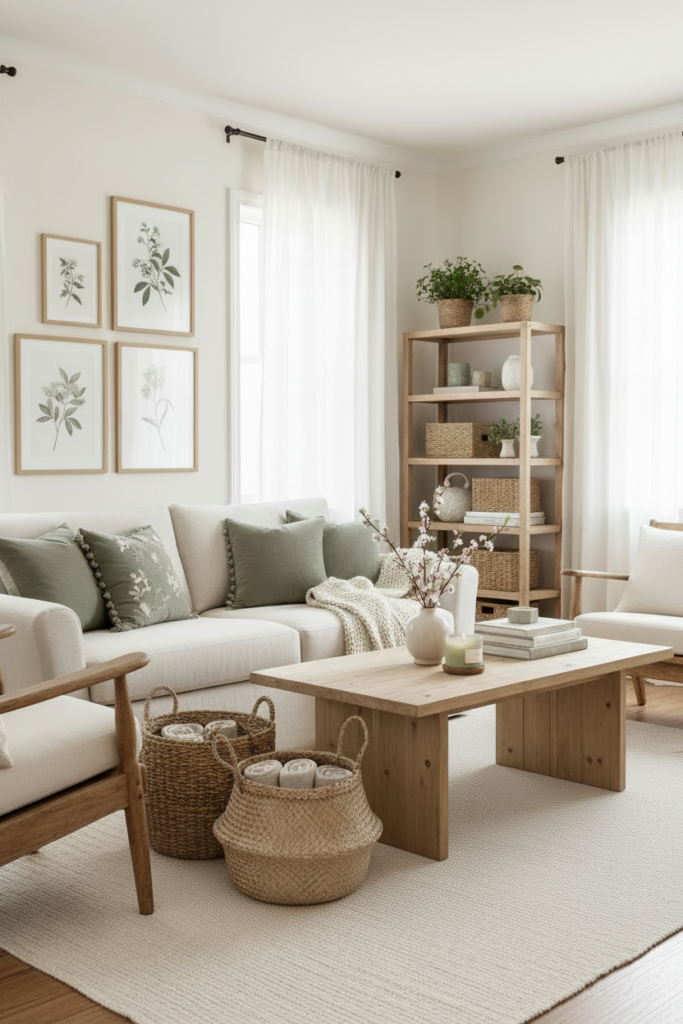
Sometimes a trio works best.
Combine cream walls, sage accents, and natural wood furniture for a layered yet simple look. Repeat each color in small ways across the room to create flow.
The palette feels cohesive, organic, and softly inviting.
How to Make It Work in Your Space
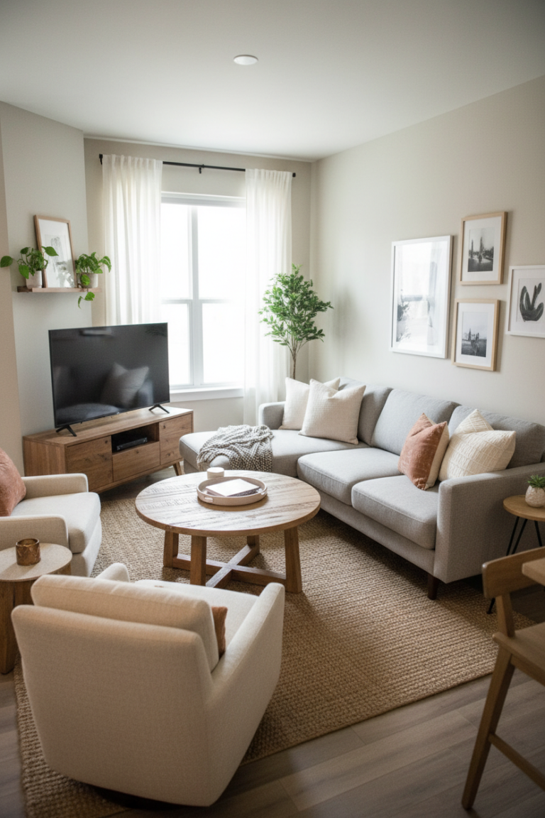
Start with one main neutral. This could be warm white, cream, or soft beige. Let it cover larger surfaces like walls or sofas.
Choose one or two accent colors from a spring palette and repeat them throughout the room in small details.
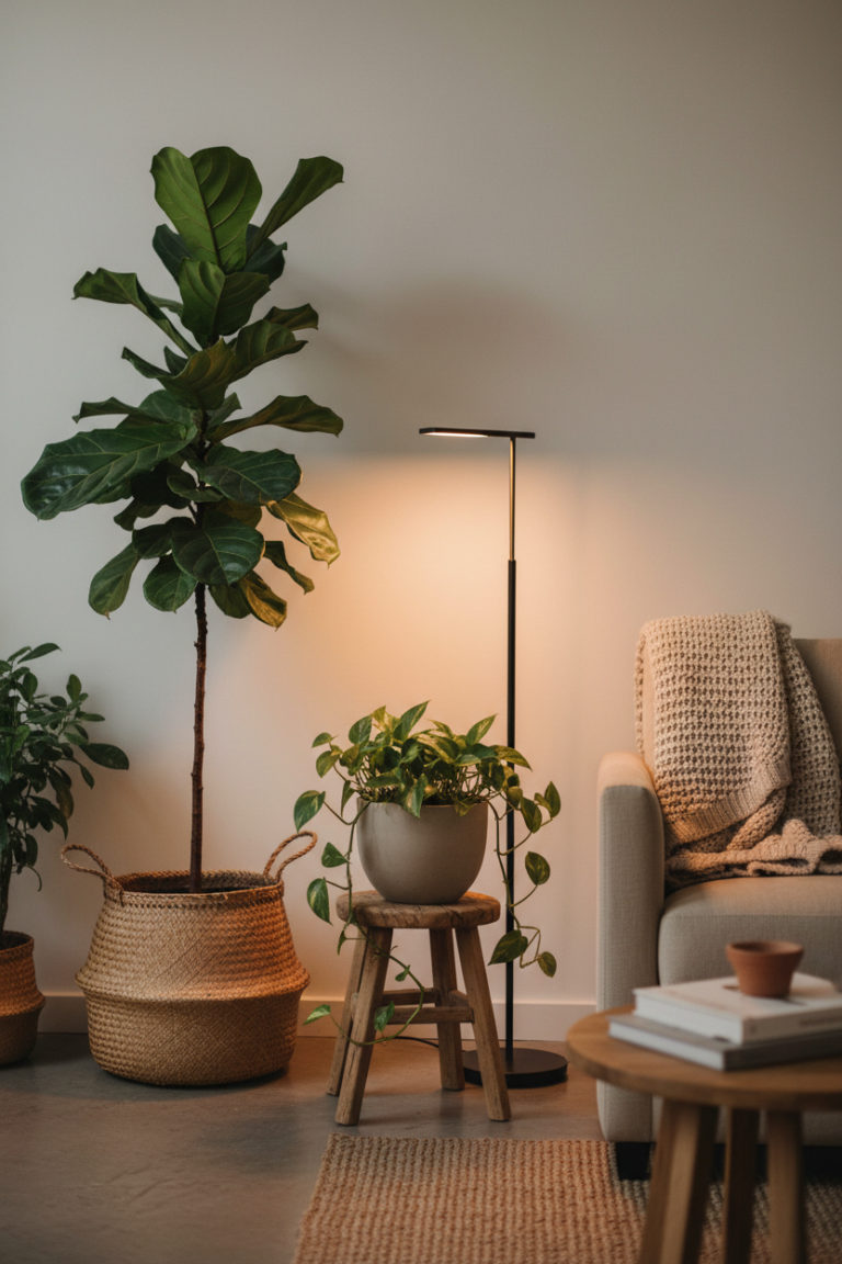
Focus on texture as much as color. Linen, cotton, woven baskets, and light wood add depth without heaviness.
Pay attention to lighting. Natural daylight will enhance soft colors, while warm bulbs in the evening will keep the room feeling cozy.
Test colors in small ways first. Swap pillow covers, add a new throw, or style a fresh floral arrangement before committing to larger changes.
A Fresh, Light-Filled Home for Spring
A light and airy spring palette can completely shift the mood of your home.
With soft neutrals, muted pastels, and natural textures, each room can feel open and calm. The goal is not to make everything bright, but to make it feel breathable and warm.
Choose colors that reflect gentle sunlight and fresh air.
This season, let your home feel like a quiet exhale after winter, filled with soft tones and welcoming light.