Floral Bedding Styling Guide for Spring
This post may contain affiliate links, which means we may earn a small commission at no extra cost to you. We may also display third-party ads and include links to partner brands or shops. Some images may be created or enhanced using AI or sourced from licensed platforms. All opinions are our own.
Floral bedding is one of the easiest ways to refresh a bedroom for spring.
But it can quickly make a room feel busy, overly sweet, or unbalanced if styled without a plan. The key is proportion, contrast, and restraint.
This guide will show you exactly how to style floral bedding so it feels soft, fresh, and cohesive rather than overwhelming.
Think balance first, decoration second.
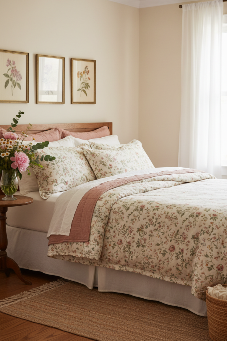
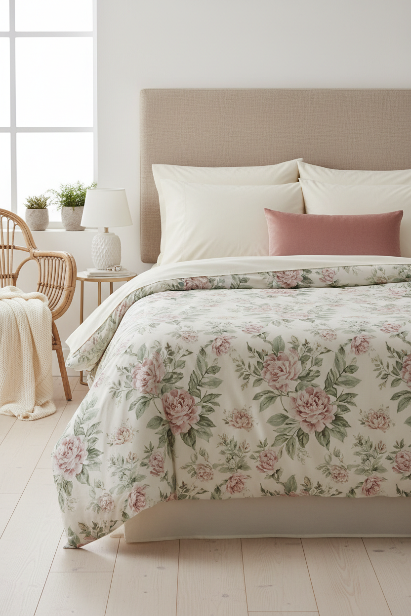
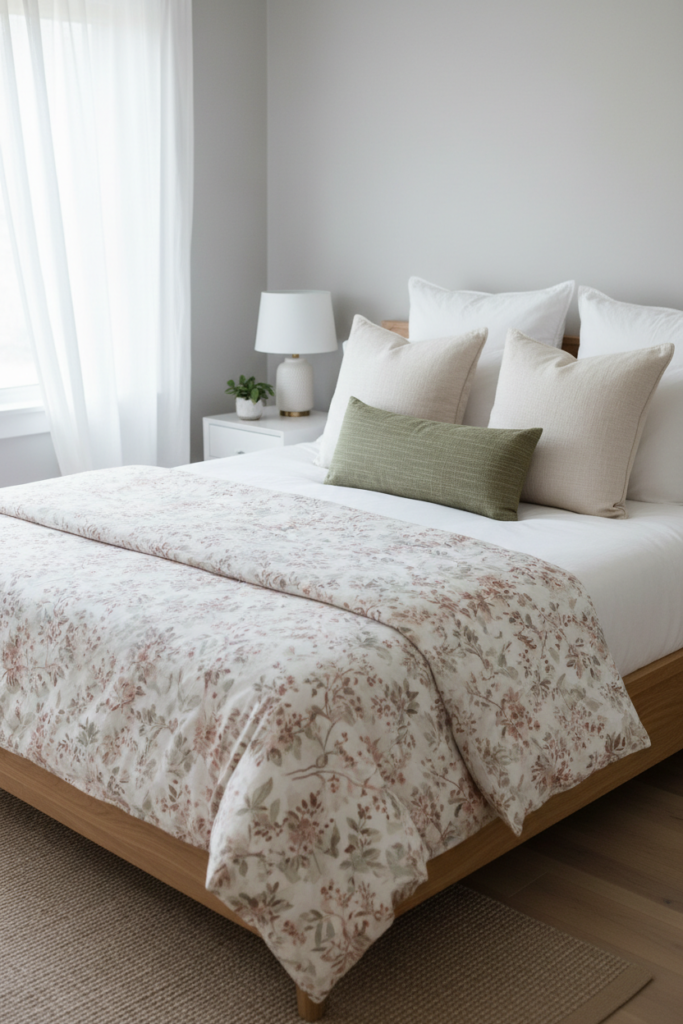
Rule 1: Choose the Right Floral Scale
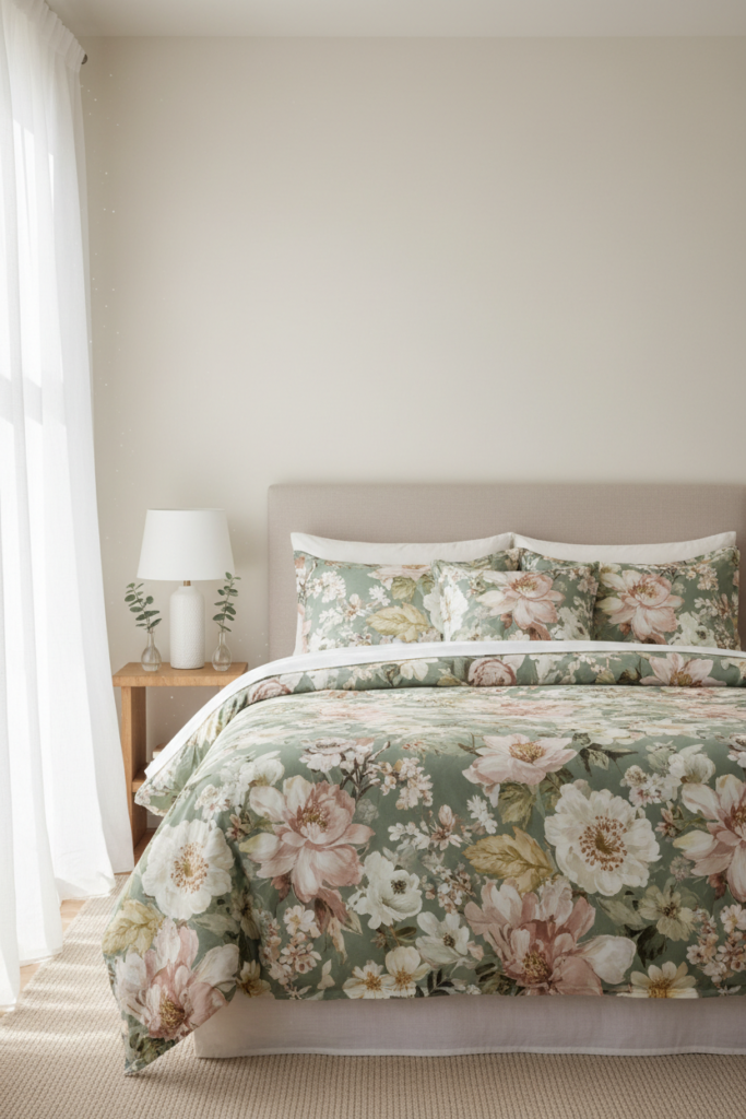
Scale determines everything.
Large-scale florals feel calmer and more modern. Small, tightly packed florals feel more detailed and traditional.
If your room is small or already layered with texture, choose a medium to large floral print. It gives the eye space to move.
If you choose a small-scale floral, keep the rest of the room very simple to prevent visual clutter.
As a general rule, the busier the floral pattern, the simpler the surrounding decor should be.
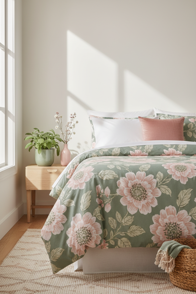
Rule 2: Follow the 60–30–10 Balance

Use this simple proportion formula for a cohesive bed:
60 percent neutral
30 percent floral
10 percent accent color
The neutral portion includes sheets, pillow shams, or a quilt. This keeps the bed grounded.
The floral portion is typically your duvet or comforter.
The final 10 percent is a small accent color pulled from the floral pattern, used in one pillow or throw.
For example:
Cream sheets and shams
Floral duvet in sage and blush
One solid blush lumbar pillow
This formula keeps the floral from dominating the entire room.
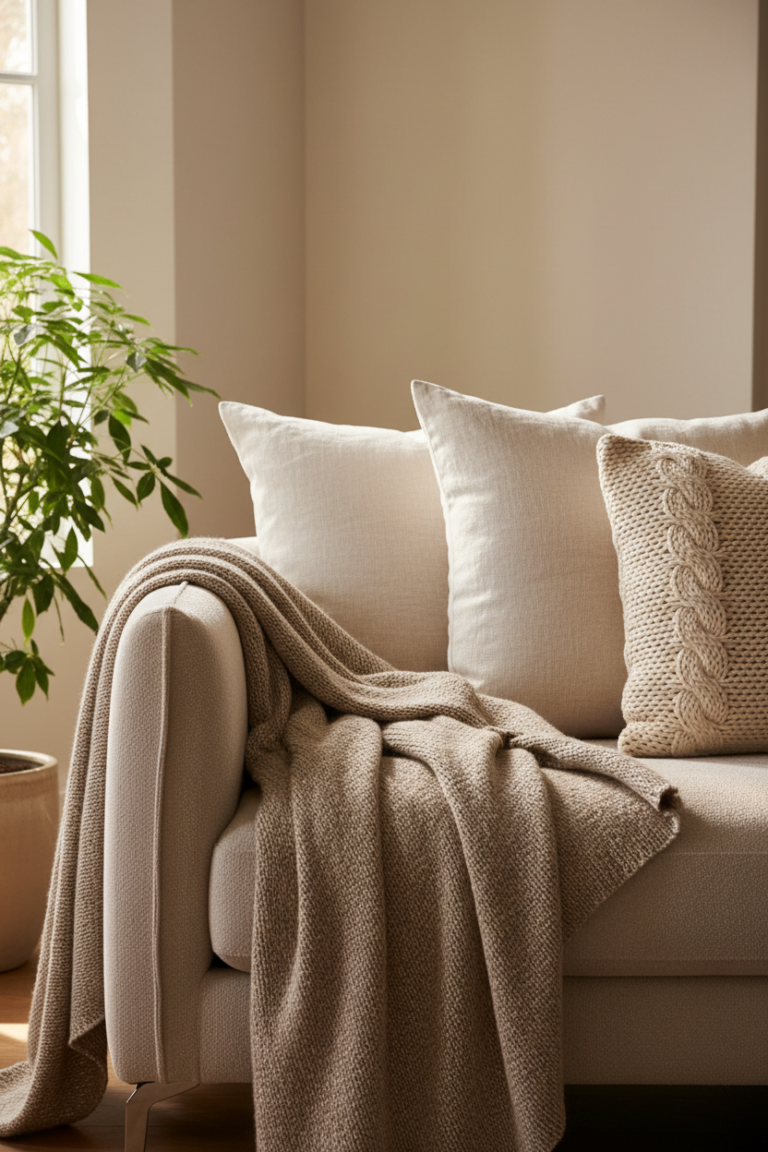
Rule 3: Pair Florals With Solid Layers
Never stack multiple busy patterns on top of each other.
Pair your floral bedding with solid pillowcases, a solid throw, or a simple quilt. These act as visual rest points.
If your duvet has a floral print, use plain sheets in white, cream, or a color pulled softly from the design.
Add a textured but solid blanket at the foot of the bed. Linen, waffle knit, or cotton works beautifully for spring.
Solids break up pattern and create calm.
Rule 4: Limit Decorative Pillows
More pillows do not equal better styling.
For a queen or king bed, aim for:
2 sleeping pillows in solid shams
2 decorative square pillows in either neutral or subtle accent
1 lumbar pillow
Keep it to five decorative pieces at most.
If the bedding is floral, at least half the pillows should be solid. This prevents visual overload.
Choose one pillow in a complementary accent color to tie the palette together.
Rule 5: Keep the Headboard and Walls Simple
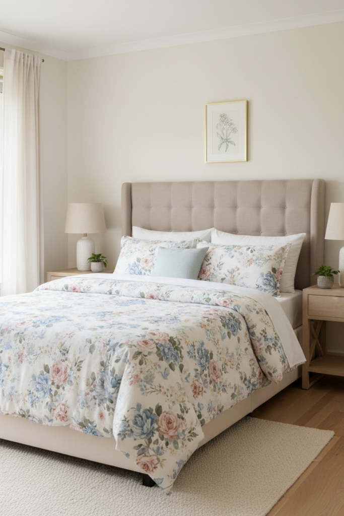
Floral bedding should be the focal point.
If your duvet is patterned, avoid patterned wallpaper or bold upholstered headboards behind it.
A neutral fabric headboard in beige, cream, or soft gray creates a clean backdrop.
Light-colored walls allow the floral pattern to stand out gently rather than compete with the surroundings.
The bed should feel like one layered composition, not a collision of patterns.
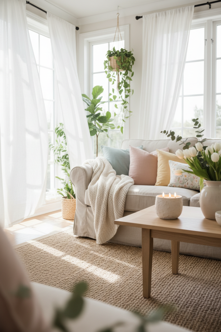
Rule 6: Balance With Texture, Not More Pattern
Instead of adding additional prints, add texture.
Incorporate woven baskets, wooden nightstands, ceramic lamps, or linen curtains.
Texture adds dimension without adding noise.
For example, pair floral bedding with:
A woven bench at the foot of the bed
A light oak nightstand
A ceramic lamp with a linen shade
This creates warmth and depth without overwhelming the eye.
Rule 7: Use Color Repetition Strategically
Pull one or two colors from your floral pattern and repeat them in small amounts around the room.
If your duvet includes sage and blush, echo sage in a plant pot or artwork. Repeat blush in a throw pillow or a small vase.
Do not introduce new unrelated colors.
Repeating tones in subtle ways creates cohesion and makes the floral bedding feel intentional.
Three small repetitions in the room is usually enough.
Common Mistakes
Using floral bedding with patterned curtains
This often creates visual conflict. Choose solid curtains instead.
Layering too many patterned pillows
Floral plus stripes plus geometric prints can quickly feel busy.
Choosing bright, high-contrast florals
Muted tones feel softer and more versatile.
Ignoring scale
Tiny florals in a large room may look cluttered. Oversized florals in a small room may overwhelm.
Forgetting white space
Allow neutral space around the bed to let the pattern breathe.
Pro Tip for a Cozier Look
Always add one soft, textured layer in a neutral tone over floral bedding.
A cream knit throw or a lightweight linen quilt folded at the foot of the bed instantly warms the look.
This layer softens the pattern and creates depth, especially in evening light.
Warm bedside lighting around 2700K will enhance the softness of both the floral and the neutral textures.
Texture plus warm light is what makes floral bedding feel cozy rather than decorative.
A Balanced Spring Bedroom
Floral bedding can transform your bedroom for spring when styled with intention.
Choose the right scale. Follow the 60–30–10 formula. Layer solids and texture. Repeat color softly.
Keep the surrounding decor calm so the floral print feels like a gentle focal point.
With these guidelines, your bedroom can feel fresh, romantic, and cozy all at once without ever looking busy.