House Paint Color Schemes for a Fresh Spring Look
This post may contain affiliate links, which means we may earn a small commission at no extra cost to you. We may also display third-party ads and include links to partner brands or shops. Some images may be created or enhanced using AI or sourced from licensed platforms. All opinions are our own.
Choosing paint colors for spring can feel overwhelming.
You want your home to feel lighter and brighter, but not cold. Fresh, but not stark. Seasonal, but still timeless. The wrong shade can make a room feel flat or disconnected from your furniture.
This guide gives you clear, usable formulas for choosing spring-ready house paint color schemes that feel fresh and cohesive without sacrificing warmth.
Think softness, balance, and undertone alignment.
Rule 1: Start With Undertone Matching
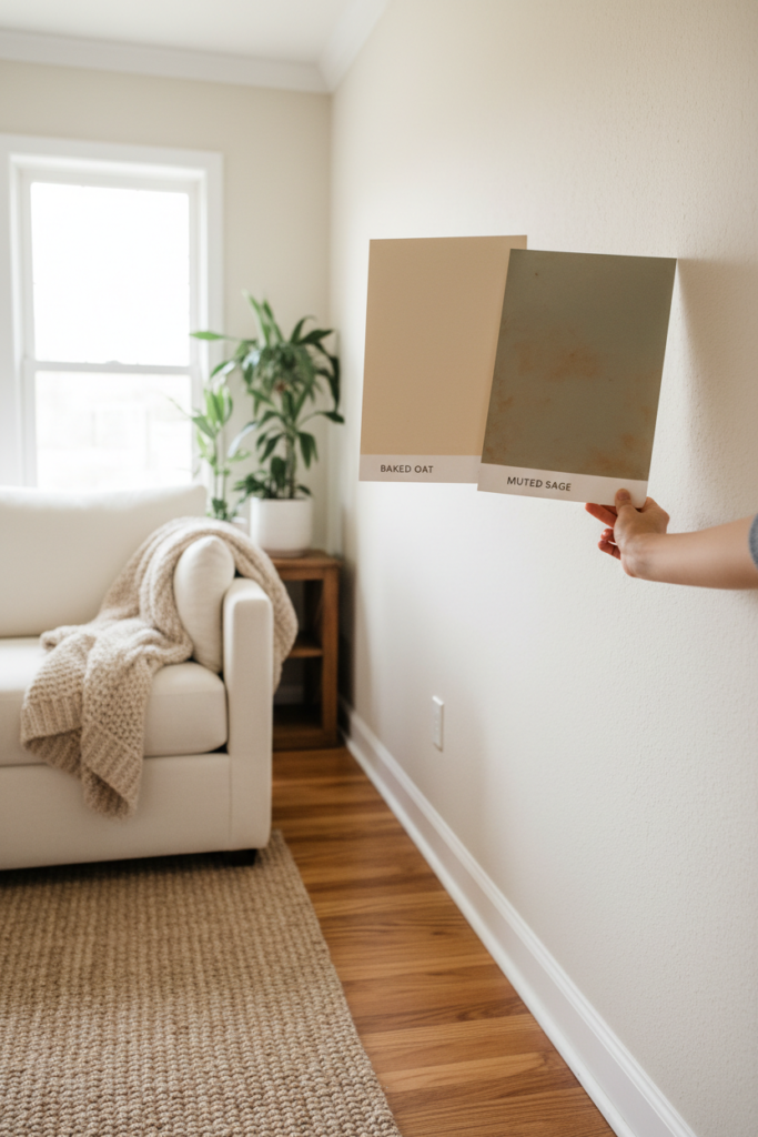
Before choosing any spring paint color, identify your home’s undertones.
Look at your flooring, cabinets, countertops, and large furniture pieces.
If you see golden, creamy, or honey tones, your home likely has warm undertones.
If you see gray, charcoal, or crisp white, your home likely leans cool.
Your spring paint must match that undertone family.
Warm homes pair best with warm whites, creamy beiges, soft sage, or muted blush.
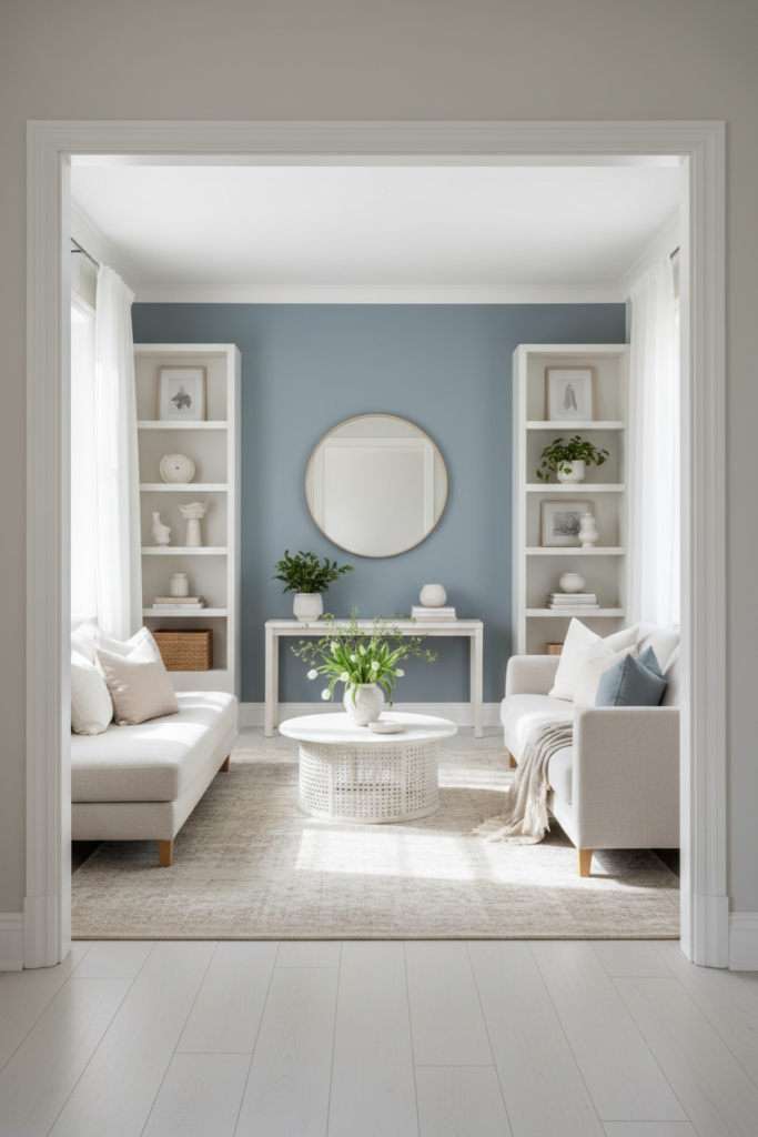
Cool homes pair best with soft grays, pale blue-grays, or clean off-whites.
Undertone mismatch is the fastest way to make a room feel off.
Rule 2: Use the 70–20–10 Paint Distribution Formula
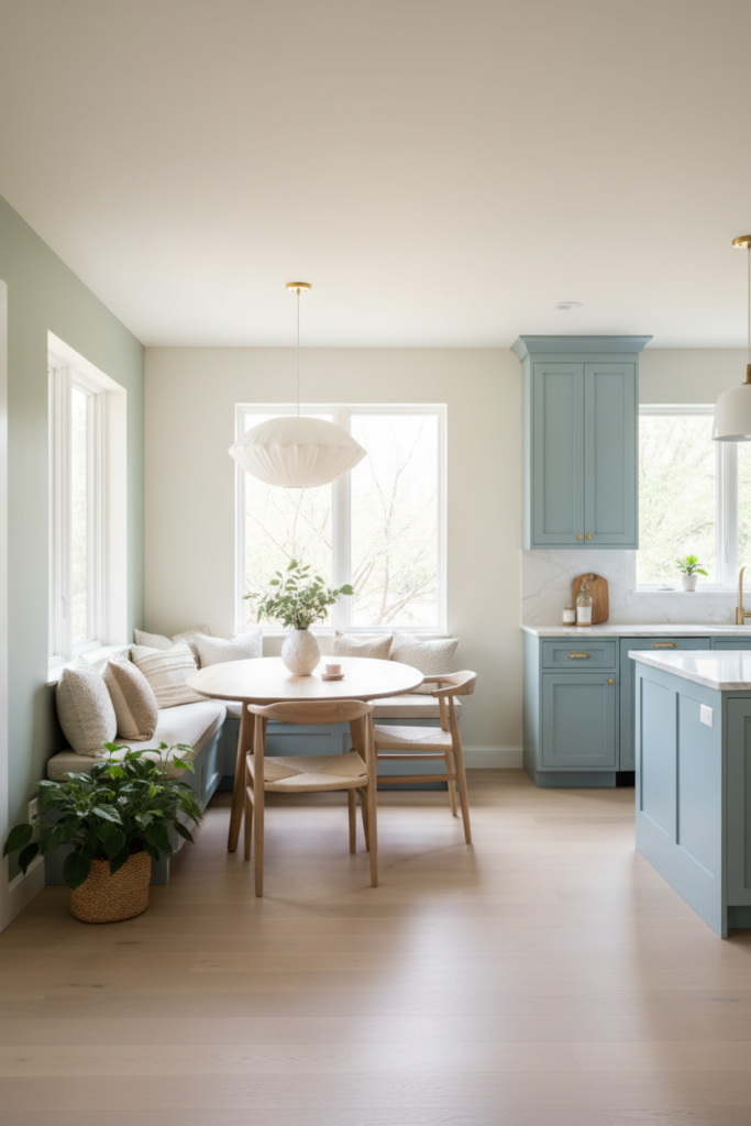
When choosing a full-home spring color scheme, follow this structure:
70 percent main wall color
20 percent secondary supporting color
10 percent accent color
The main wall color should be neutral and light-reflective. This covers most visible surfaces.
The secondary color may appear in adjoining rooms, built-ins, or a feature wall.
The accent color appears in small painted furniture pieces, doors, or decorative trim.
For example:
70 percent warm white
20 percent muted sage in a dining nook
10 percent soft blue on a painted cabinet
This keeps the home cohesive while adding subtle seasonal freshness.
Rule 3: Choose the Right Light Reflectance Value
Light reflectance value, or LRV, measures how much light a paint color reflects.
For a fresh spring look, aim for wall colors with an LRV between 60 and 85.
Below 60 may feel too heavy for spring.
Above 85 may feel stark or sterile.
Soft whites, pale greiges, and light pastels in this range brighten a room without washing it out.
If your room lacks natural light, lean toward the higher end of that range.
If your space gets strong sunlight, choose a slightly lower LRV to prevent glare.
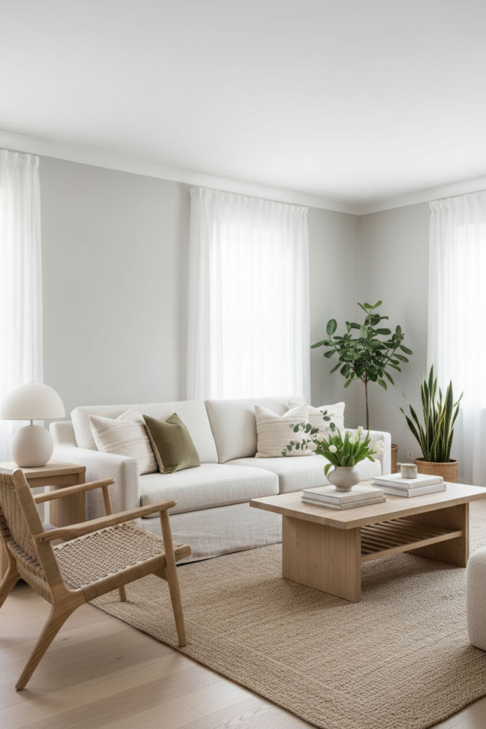
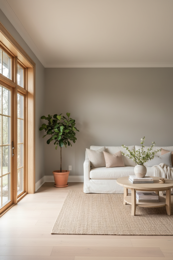
Rule 4: Use Soft Contrast Instead of High Contrast
Spring palettes feel best with gentle contrast.
Instead of pairing bright white walls with dark charcoal trim, try:
Warm white walls with creamy trim
Light greige walls with soft white trim
Pale sage walls with warm off-white trim
Keep trim 1 to 2 shades lighter than the wall color within the same undertone family.
This subtle contrast keeps the space airy but still cozy.
Avoid harsh black-and-white combinations if you want a soft spring mood.
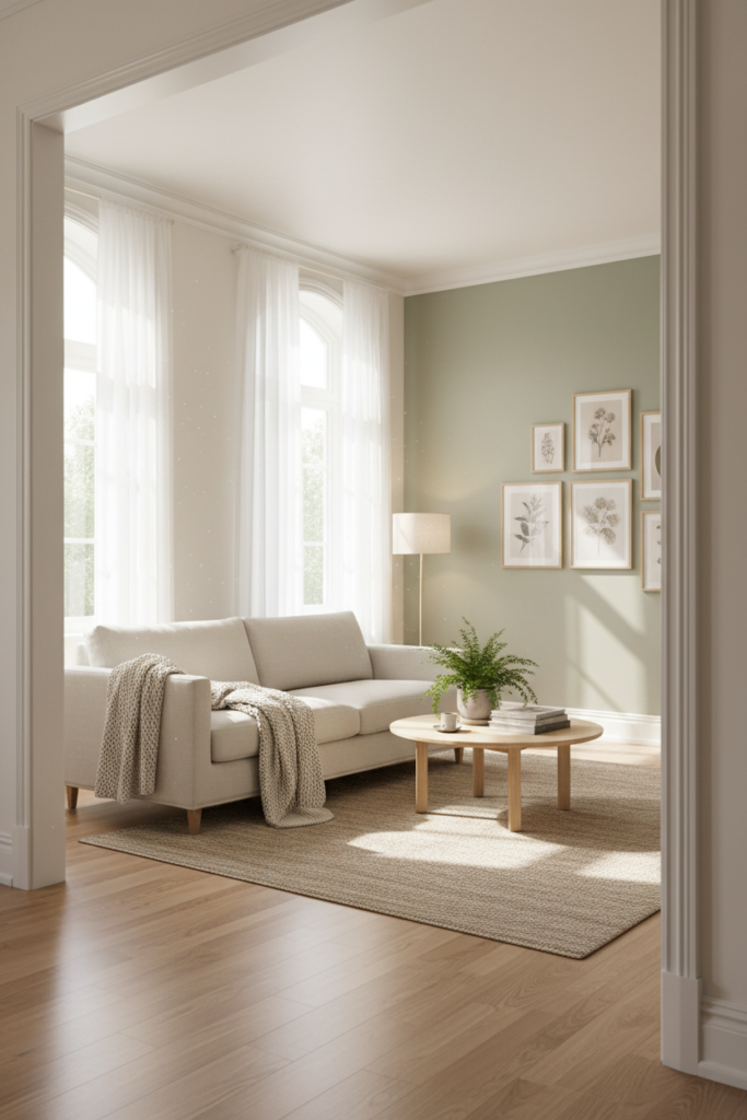
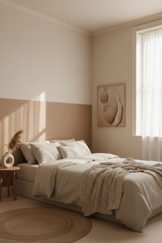
Rule 5: Incorporate Nature-Inspired Accent Walls Carefully
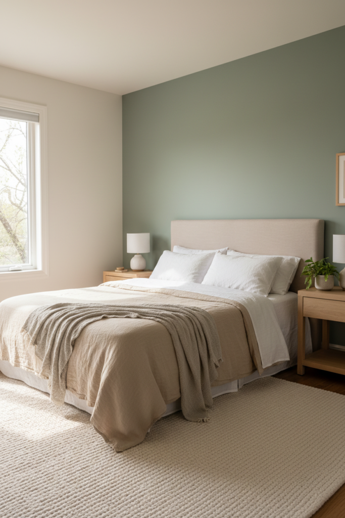
If you want to introduce color, use nature-inspired tones sparingly.
Good spring accent options include:
Muted sage
Dusty blue
Soft clay
Pale lavender-gray
Limit accent walls to one per space.
Choose walls that anchor furniture, such as behind a bed or sofa.
Accent walls should not exceed 20 percent of the visible painted surfaces in a room.
Too many colored walls remove the lightness you are trying to create.
Rule 6: Keep Ceilings and Trim Soft, Not Stark
Crisp bright white ceilings can feel too sharp against warm spring walls.
Instead, choose ceiling paint that is one shade lighter than your wall color, or use a soft white with a warm undertone.
Trim should feel cohesive, not high-contrast.
For example:
Warm white walls + slightly lighter creamy trim
Greige walls + soft neutral white trim
This keeps transitions smooth and relaxed.
Spring color schemes benefit from subtle shifts, not dramatic changes.
Rule 7: Test Paint in Multiple Lighting Conditions
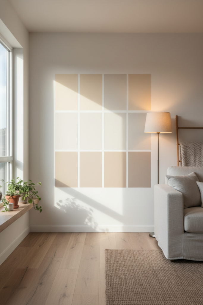
Always test paint in at least two areas of the room.
Paint large sample swatches, at least 12 by 12 inches.
Observe them in:
Morning light
Midday light
Evening lamp light
Spring sunlight tends to be brighter and more golden than winter light.
Warm paint may glow beautifully during the day but appear darker at night.
Testing prevents costly repainting mistakes.
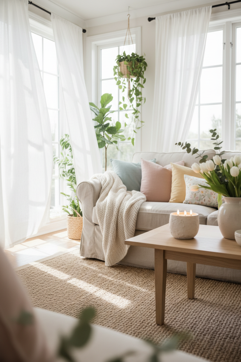
Sample Fresh Spring Paint Schemes
Warm and airy:
Soft cream walls
Muted sage accent
Light oak floors
Warm white trim
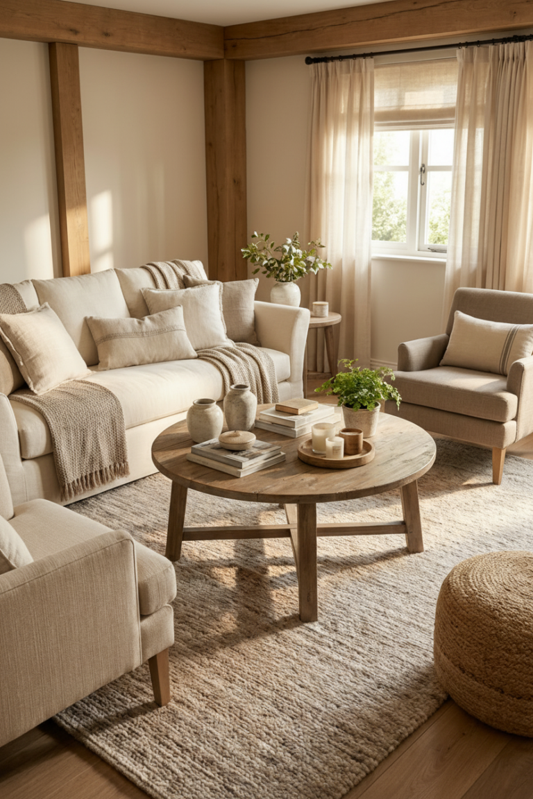
Cool and fresh:
Light greige walls
Dusty blue accent
White oak furniture
Soft neutral white trim
Minimal and bright:
Pale beige walls
Clay-toned accent
Natural linen textiles
Warm off-white trim
Each palette balances brightness with softness.
Common Mistakes
Choosing paint that is too cool
Blue-based whites can feel sterile in cozy homes.
Using high-saturation pastels
Bright mint or baby pink can overpower a room.
Painting every room a different color
Limit yourself to 2 to 3 coordinated tones across the home.
Ignoring undertones in flooring
Warm floors need warm walls.
Skipping large test swatches
Small samples rarely show true color depth.
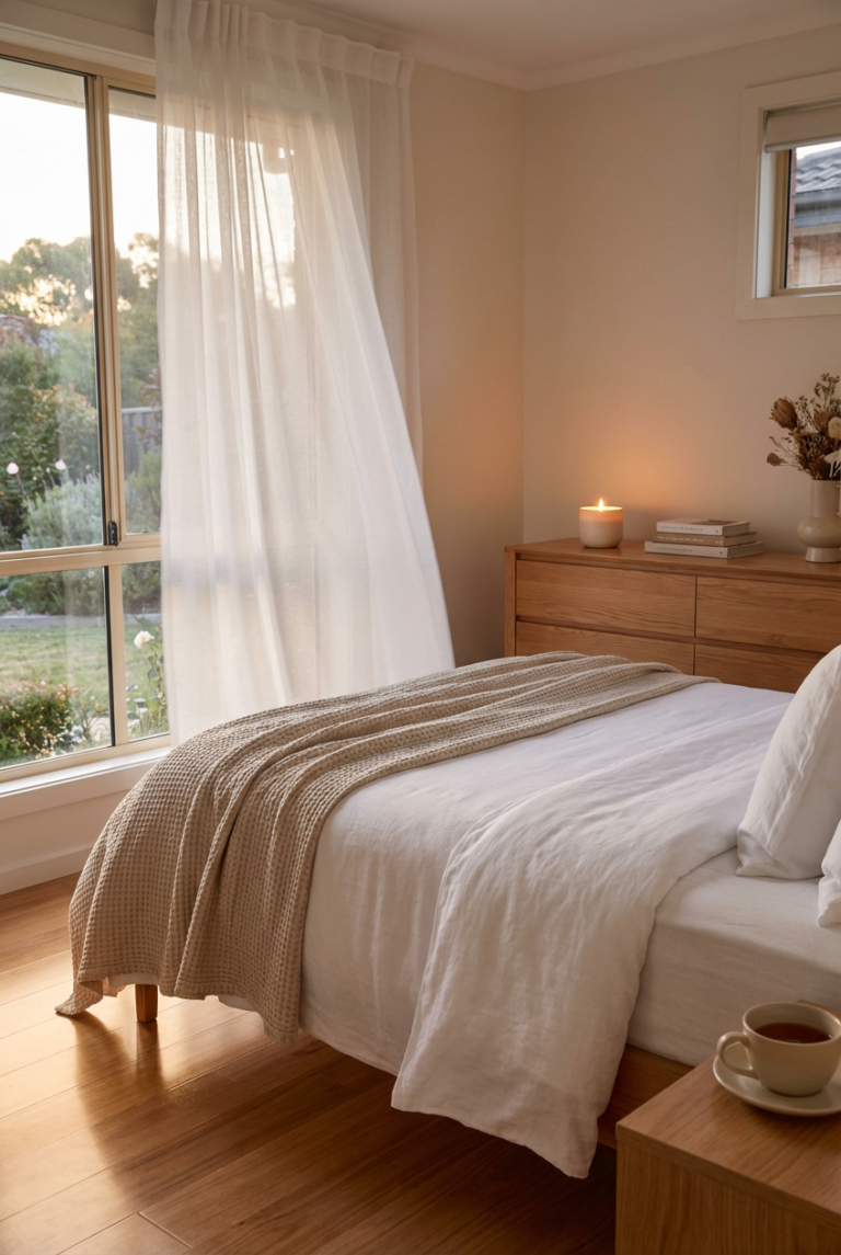
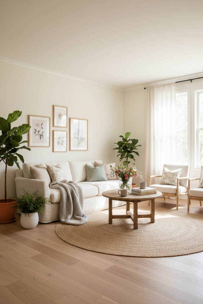
Pro Tip for a Cozier Look
Balance fresh paint with natural texture.
After repainting, add linen curtains, woven baskets, wood furniture, and ceramic decor.
Paint brightens the room. Texture warms it back up.
Fresh spring walls paired with tactile materials create a space that feels light without feeling cold.
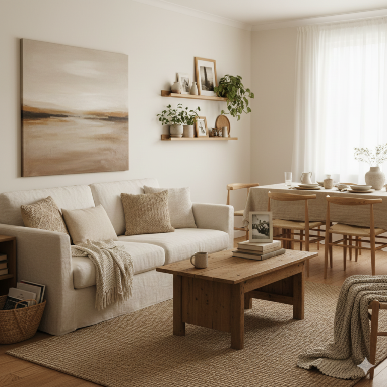
A Balanced Spring Refresh
A fresh spring paint scheme is about clarity, not complexity.
Match undertones. Follow the 70–20–10 formula. Choose high-LRV neutrals. Keep contrast soft. Test before committing.
When done thoughtfully, paint can transform your home into a brighter, more open space while still preserving comfort.
Light walls, warm texture, subtle contrast.
That is the formula for a spring-ready home that still feels cozy.
Hi, I’m Livia. A mom who believes that a house becomes a home through the little things.
Over time, I started to understand what truly makes a space feel cozy, comfortable, and safe. Little by little, I transformed my own home into a place where my family and I genuinely love to be, a space that feels calm, warm, and ours.
Here, I share simple ideas and thoughtful inspiration to help you turn your home into your favorite place in the world too.